
Every year, the world of interior design eagerly anticipates the announcement of the “Colors of the Year” by leading design institutions. These colors, chosen after meticulous research and trendspotting, set the tone for what our living spaces could look like in the year to come. They influence not just home decor, but also fashion, advertising, and other design-driven industries. But how do you take these trendsetting colors and adapt them into your living space without a complete overhaul? Let’s explore.
Understanding the “Colors of the Year”
First, it’s essential to grasp the concept. When design authorities like Pantone, Behr, and Sherwin-Williams release their chosen hues, they’re not just selecting random pretty colors. They’re capturing a snapshot of the global mood, mindset, and socio-cultural shifts. This year’s colors might be inspired by anything from the tranquility of nature to the digital age’s vibrancy. Understanding the story behind the color can guide its application in home decor.
Incorporating the Trending Hues
Once you’ve got a handle on the chosen colors and their significance, it’s time to weave them into your home’s tapestry. Here’s a roadmap:
- Start Small: If you’re unsure about a color, begin with subtle touches. Throw pillows, blankets, vases, or wall art are excellent ways to introduce a new shade without committing to it fully.
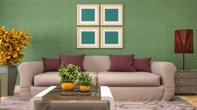
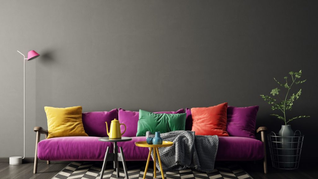
- Statement Furniture: Feeling a bit braver? A piece of furniture in the trending color can become the focal point of a room. Whether it’s a teal couch or a burnt orange coffee table, let it stand out. Surround it with neutral tones to make it pop.
- Accent Walls: Painting an entire room might feel overwhelming, but an accent wall can provide a striking backdrop without being overbearing. Plus, it’s relatively easy to repaint if you wish to switch things up in the future.
- Utilize Decorative Accents: Decor elements like curtains, rugs, and lamps can also reflect the year’s trending colors. These pieces are functional, interchangeable, and can be layered to create depth and contrast.
- Natural Incorporation: If the color of the year has any roots in nature (like sky blue or forest green), incorporate it through plants or natural decorative elements like stones, shells, or wooden artifacts.
Harmonizing with Existing Decor
Just because there’s a new set of trending colors doesn’t mean your existing decor becomes obsolete. It’s all about harmonizing:
- Complementary Colors: Use the color wheel. If the new trend is a shade of blue, and your room is dominantly in oranges or browns, you’re in luck. These colors complement each other and can create a harmonious look.
- Neutral Base: If your home already boasts a neutral palette (whites, grays, beiges), introducing the color of the year becomes even more manageable. Neutrals provide a canvas against which most other colors shine.
- Layering and Texturing: A room’s visual appeal isn’t just about color but also texture. Mix and match different materials — like a velvet chair in the new hue against a sleek, modern table — to add depth.
Being Mindful of Overdoing
In the excitement of introducing the trendy color, there’s a risk of overdoing it. Remember:
- Balance is Key: If you’ve introduced the new color in large furniture, balance it out with neutral tones in other significant elements like walls or floor coverings.
- Reversible Changes: When trying out bold trends, consider reversible changes. Removable wallpapers, slipcovers, and interchangeable decor elements can be switched out if you feel the need for a change.
The Psychology of Color in Home Decor
Diving deeper than just aesthetics, the colors we choose for our homes often resonate with our emotional and psychological needs. Each hue holds the power to influence our moods, thoughts, and overall wellbeing.
- Emotional Resonance: Colors carry emotional weight. For instance, blues typically calm the mind and promote tranquility, while yellows can evoke feelings of happiness and energy. When adopting the color of the year, consider how it aligns with the emotional atmosphere you wish to create in your space.
- Perception of Space: Beyond emotions, colors can manipulate the perception of space. Lighter colors can make a room appear more spacious, while darker tones tend to create a cozier, more intimate feel. If the color of the year is on the darker spectrum and you have a smaller space, use it strategically so it doesn’t overwhelm the room.
Integrating Vintage and Modern: A Timeless Blend
One of the beauties of interior design is the fluidity between eras. While the colors of the year reflect contemporary trends, they can beautifully merge with vintage pieces, crafting a space that feels both timeless and modern.
- Vintage Accents: If the trending color reminds you of a past era, scout for vintage pieces in flea markets or antique stores. An old-world lamp or a mid-century chair can become a statement piece against the backdrop of a modern color palette.
- Storytelling through Decor: Using the color of the year as a base, weave in stories with pieces from different times. For instance, a wall painted in the trendy hue can showcase framed black and white family photos, bridging the gap between past and present.
In Conclusion
The “Colors of the Year” offer a fresh perspective on how we perceive our spaces and how they resonate with the times we live in. While it’s exciting to incorporate these new shades, it’s essential to ensure they align with your personal style and the existing decor. After all, your home should be a reflection of you — with just a touch of the year’s trends.